Healthcare Design
Patient Request Management Design

Overview
A regional hospital operates with a lean, centralized team of doctors and nurses responsible for handling inpatient requests across multiple wards. Patients submit requests via a physical call-button system, which routes all alerts to a central nursing station.
Problem Statement
Although staff obtain all requests in a single location, they do not have a structured digital system that allows them to prioritize, assign, track and close requests. This has resulted in delays, no follow ups and repeated work, thus increased staff stress.
Key Challenge
How might we help a small, mobile healthcare team efficiently manage multiple simultaneous inpatient requests without increasing cognitive load?
My Role
UX/UI Designer – Providing a solution for this problem by ensuring that healthcare professionals are able to easily manage inpatient requests for both the central station (web) and on-the-go (mobile app) scenarios.
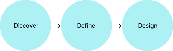
Process
For this design problem, I followed 3D- DIscover, Define and Design phases to create a solution for this problem.
Secondary Research & Business Relevance- Discover
Conducted market research to identify current situation and key challenges faced in this sector.
Findings
Nurse Workflow & Mobility
Nurses spend most of their time moving between rooms, multitasking, handling interruptions.
Staffing & Cognitive Load
Lean nurse staffing is linked to poorer patient outcomes and with that immense amount of cognitive load builds.
UX Best Practices in Healthcare
Minimize cognitive load
Limit visible choices per screen
Use color strictly for critical states
Maintain consistent layouts to build muscle memory
Target Audience
Primary Target Users- Nurses & Doctors
Role & Responsibilities
Primary responders to the majority of inpatient requests
Manage urgent and non urgent tasks
Communicate with doctors when necessary
Keep moving from one patient room to another and the nursing station
User Mental Models
What needs attention now?
What am I responsible for?
Is someone else already handling this?
What’s still pending?
User Pain Points
Forgetting non-urgent requests
Handling the same request twice
Confusion during peak load
No clarity on ownership
Feeling overwhelmed
Stress from constant interruptions
Frustration with manual coordination
User Needs
Clear prioritization
Explicit ownership
Request tracking
Fast status updates
Confidence that nothing is missed
Reduced stress
User Constraints & Design Implications
Limited attention > At-a-glance information
One-hand usage > Large tap targets
High interruptions > Persistent status visibility
Stress & fatigue > Minimal choices
Mobility > Mobile-first execution
Define
The Define phase is where my research insights and understanding of the user are translated into a product direction. With evidence and user needs in mind, this phase defines who I am designing for, what problems I need to solve, and the principles and strategies that will inform all of my design decisions on the web and mobile.
Core Goals
Instant Clarity- Staff should understand what is urgent, what is pending, who is handling what within seconds.
Zero Duplication- No two staff members should unknowingly handle the same request.
Reliable Follow-through- No request should be forgotten due to interruptions.
Minimal Cognitive Load- The system should reduce thinking.
Design Principles
Status Over Memory- Never depend on staff to remember the state of a request.
Urgency Before Detail- Critical information should be visible without interaction.
One Request, One Owner- Ownership is clear and always visible.
Fewer steps and clicks- Every action should require the fewest possible taps.
Web App Strategy
Primary Purpose
Situational awareness
Coordination and assignment
Key Capabilities
View all active requests across wards
Filter by urgency, ward, status
Assign or reassign requests
Monitor request aging and completion
Design Focus
High information density with clarity
Visual prioritization
Minimal interaction for assignment
Mobile App Strategy
Primary Purpose- Execution and follow-through
Key Capabilities
‘My Requests’ focused view
Clear next action for each request
One-tap status updates
Optional read-only overview
Design Focus
Speed over completeness
One-handed usability
Minimal navigation depth
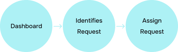
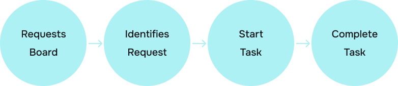
User Flow
Web
Mobile
Design
The Design phase involves the creation of interfaces based on the defined needs of the users and the insights gathered from research. Based on principles such as status over memory, urgency before detail, and minimal interaction cost, the solution is designed to help the healthcare staff in high-pressure, mobile environments.
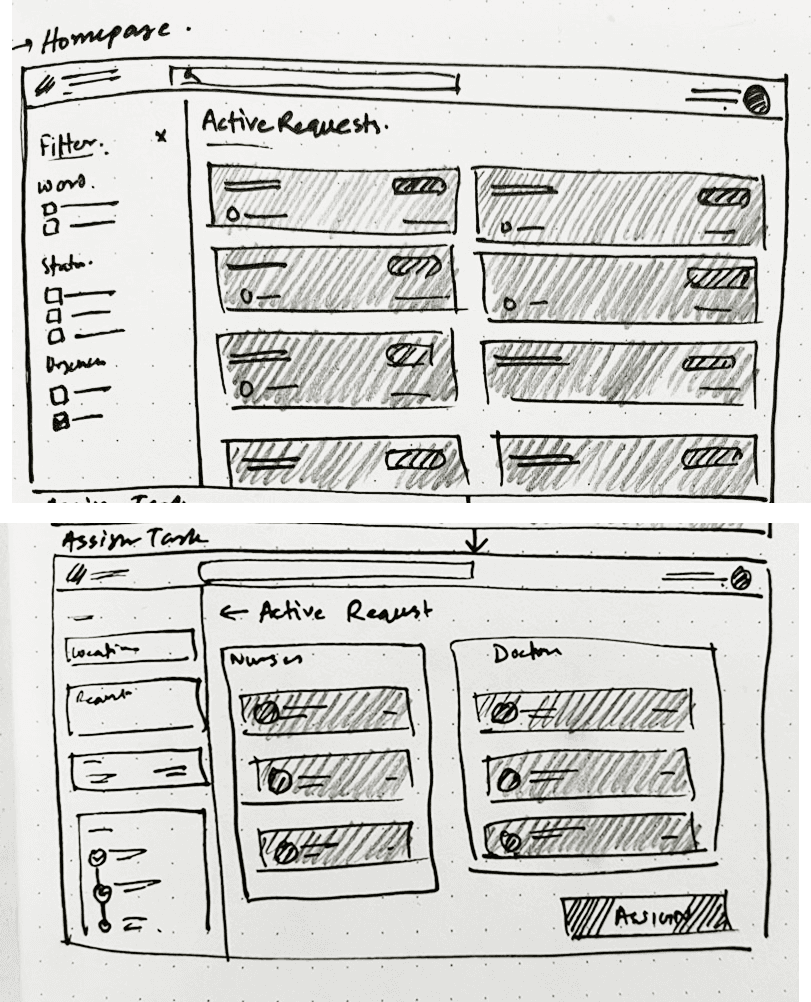
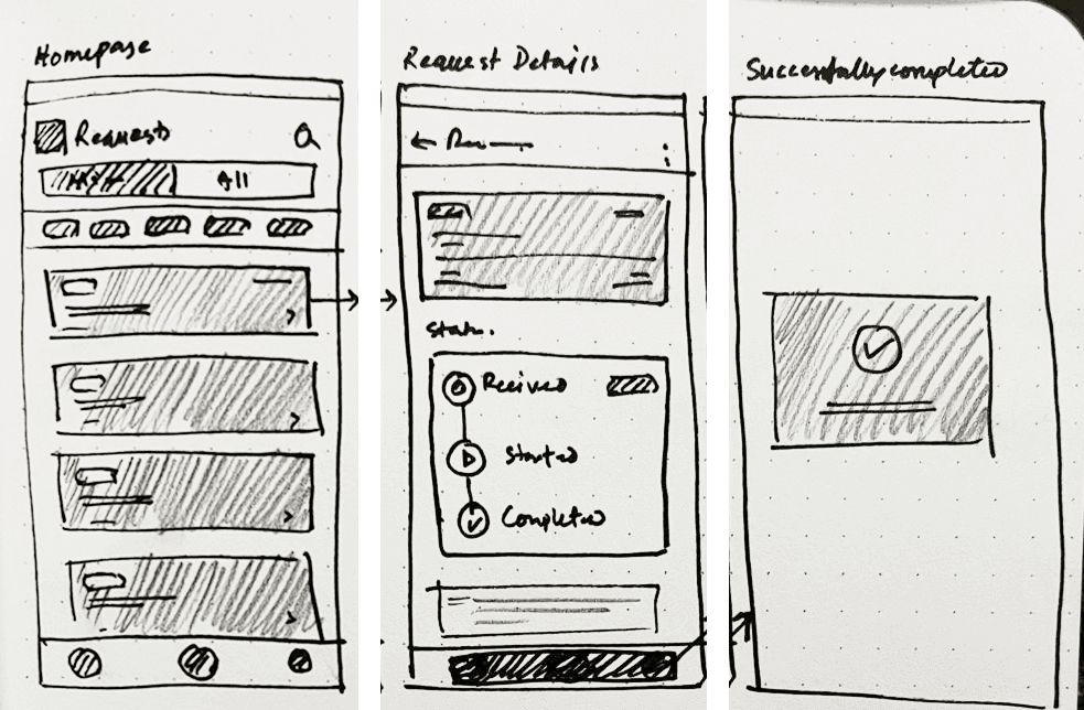
Low-Fidelity Sketches (Web)
Low-Fidelity Sketches (Mobile)
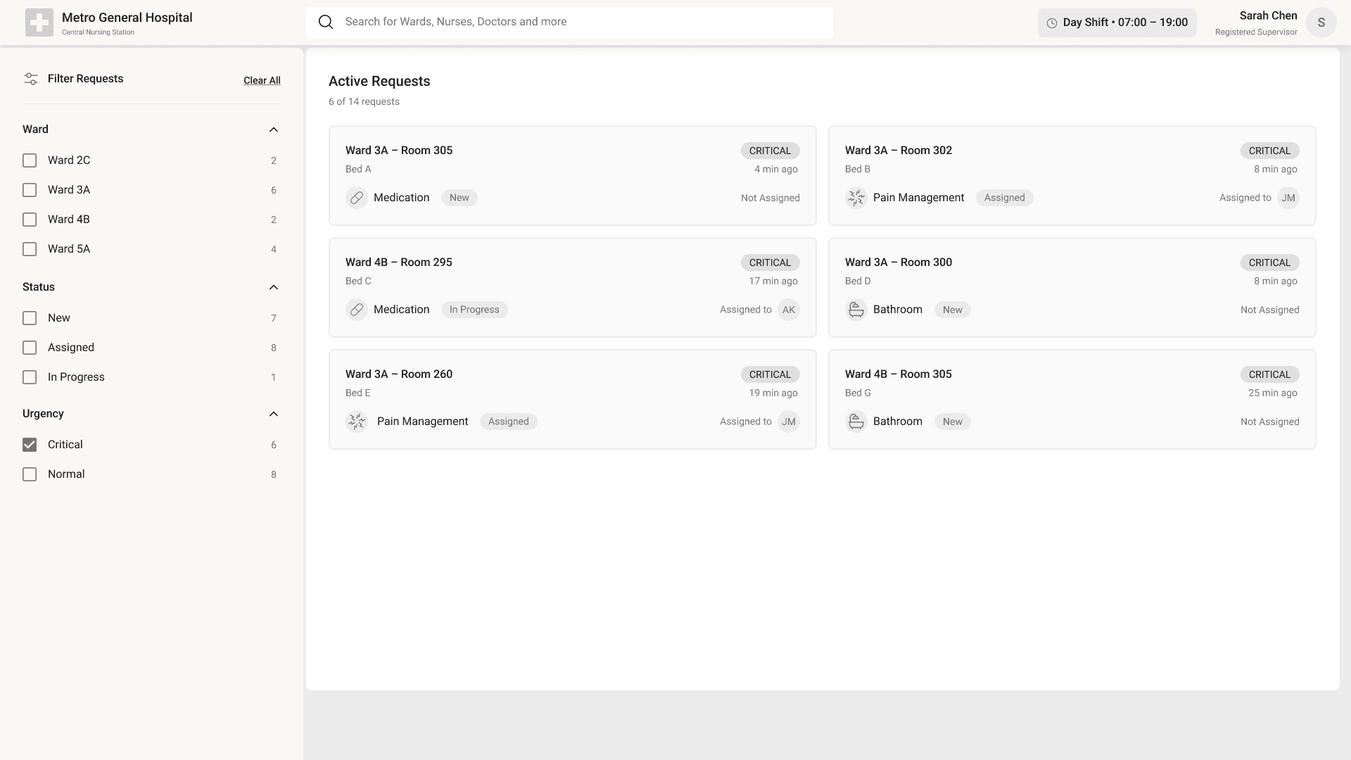
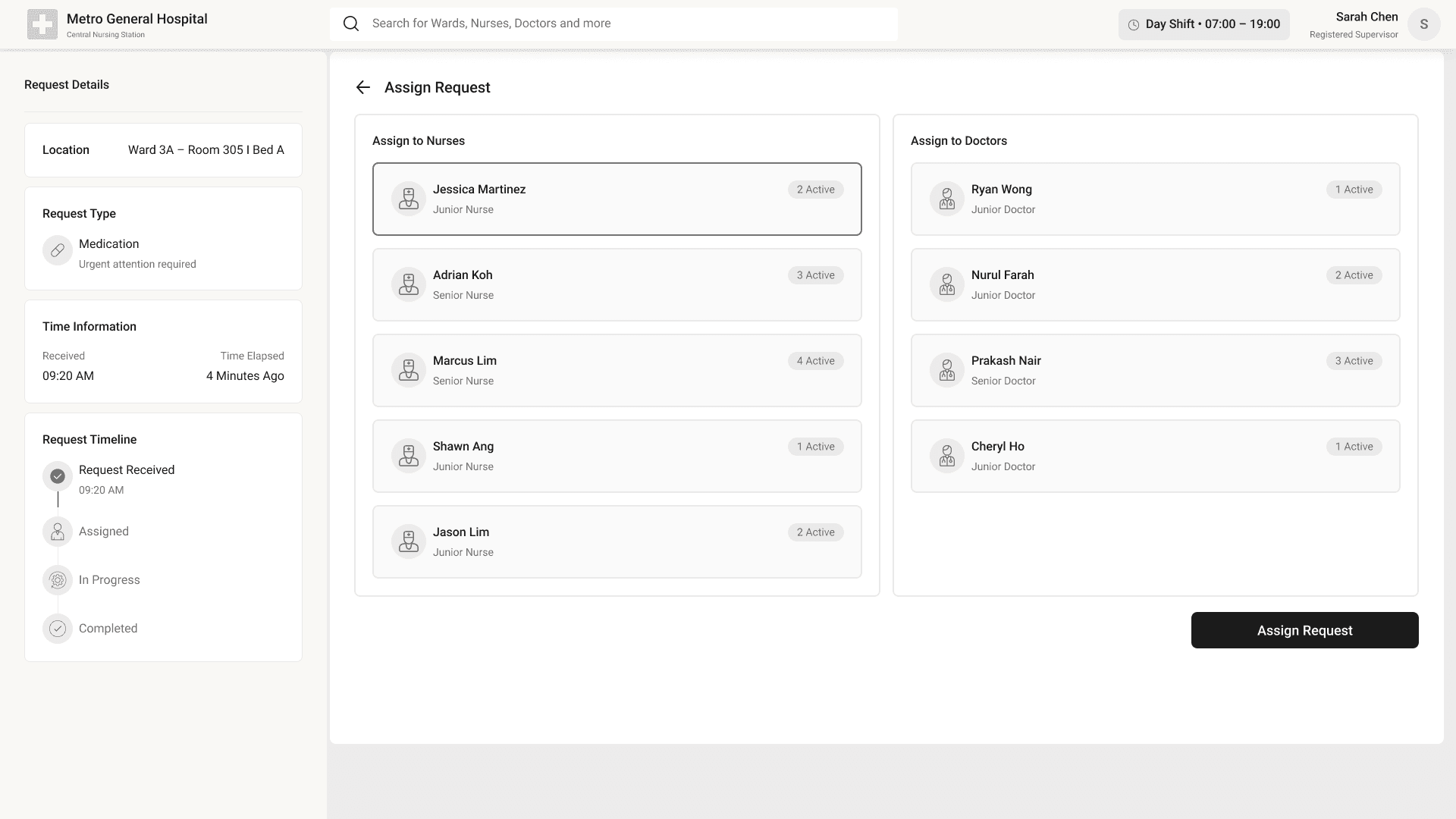
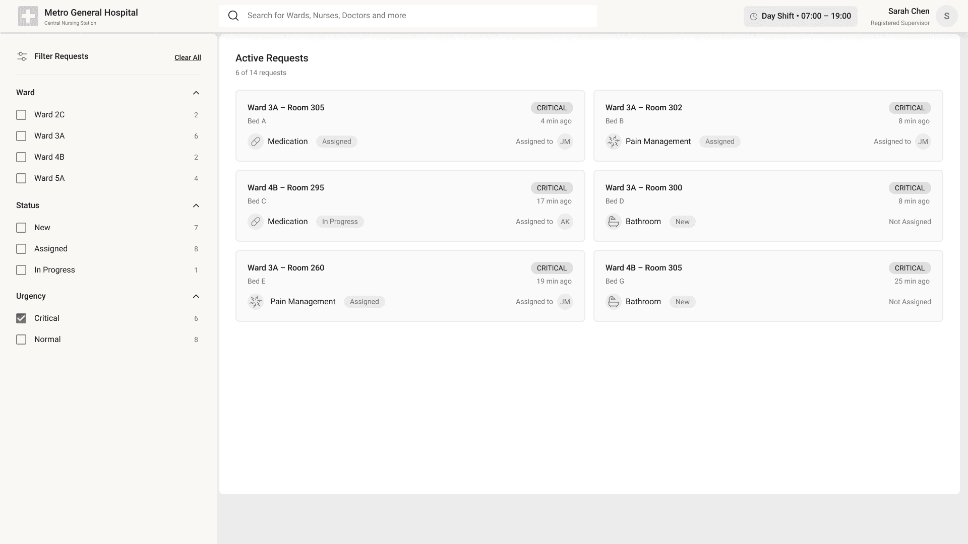
Mid-Fidelity Wireframe (Web)
The wireframes concentrate on the aspects of request prioritization, ownership and status, ensuring that healthcare professionals are able to easily view, assign, and respond to inpatient requests for both the central station (web) and on-the-go (mobile app) scenarios.
Mid-Fidelity Wireframe (Mobile)
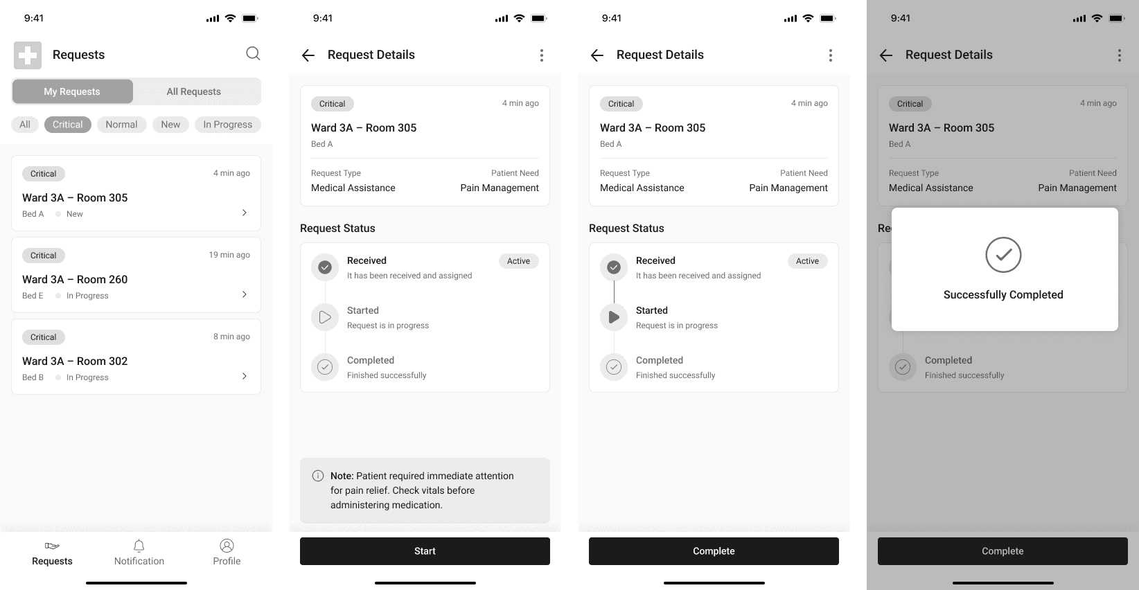
High-Fidelity Design
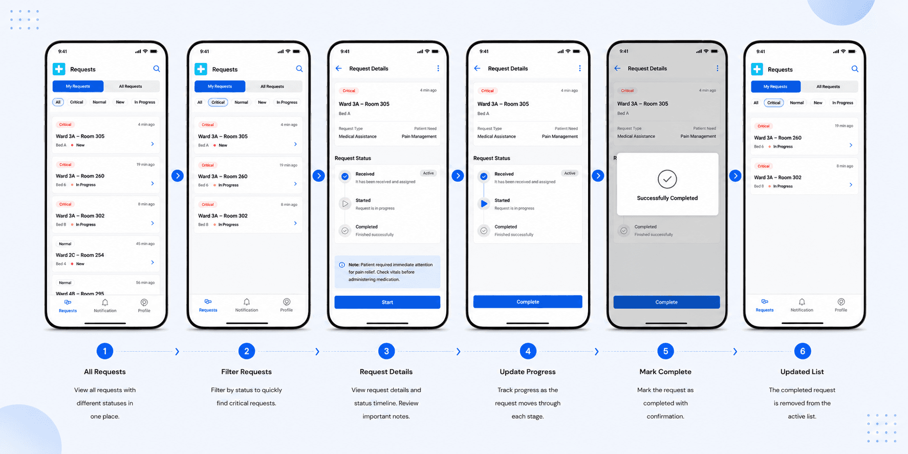
High-fidelity designs were developed for the mobile app. The designs focus on clarity, urgency detection, and one-handed use, taking validated workflows and making them production-ready and polished for the safe and efficient execution of requests.


Key Learnings
Designing for high-pressure environments requires reducing cognitive load through clear hierarchy, minimal actions, and instant visibility of critical information.
UX decisions become more impactful when backed by user research, workflows, and real-world operational constraints instead of visual assumptions alone.
Mobile-first healthcare interfaces must prioritize one-handed usability, fast interactions, and large touch targets for users constantly in motion.
Effective product design is not only about usability but also about improving coordination, ownership clarity, and reducing human errors in complex systems.
Simplicity in UI often comes from deeply understanding user behavior, interruptions, urgency, and mental models within real working environments.
Conclusion
This case study helped me understand how thoughtful UX design can reduce stress, improve coordination, and support faster decision-making in high-pressure healthcare environments. Through research, workflow analysis, and iterative design, I learned the importance of designing for clarity, urgency, and minimal cognitive effort. The project strengthened my ability to combine user empathy, product thinking, and interface design to solve real-world operational challenges.