Quick Commerce Delivery App Design
Jiffy App- Reimagined, Redesigned

Overview
Jiffy is a quick-commerce grocery delivery app that delivers more than 2000 products in about 30 minutes throughout West Bengal and Uttar Pradesh.
Problem
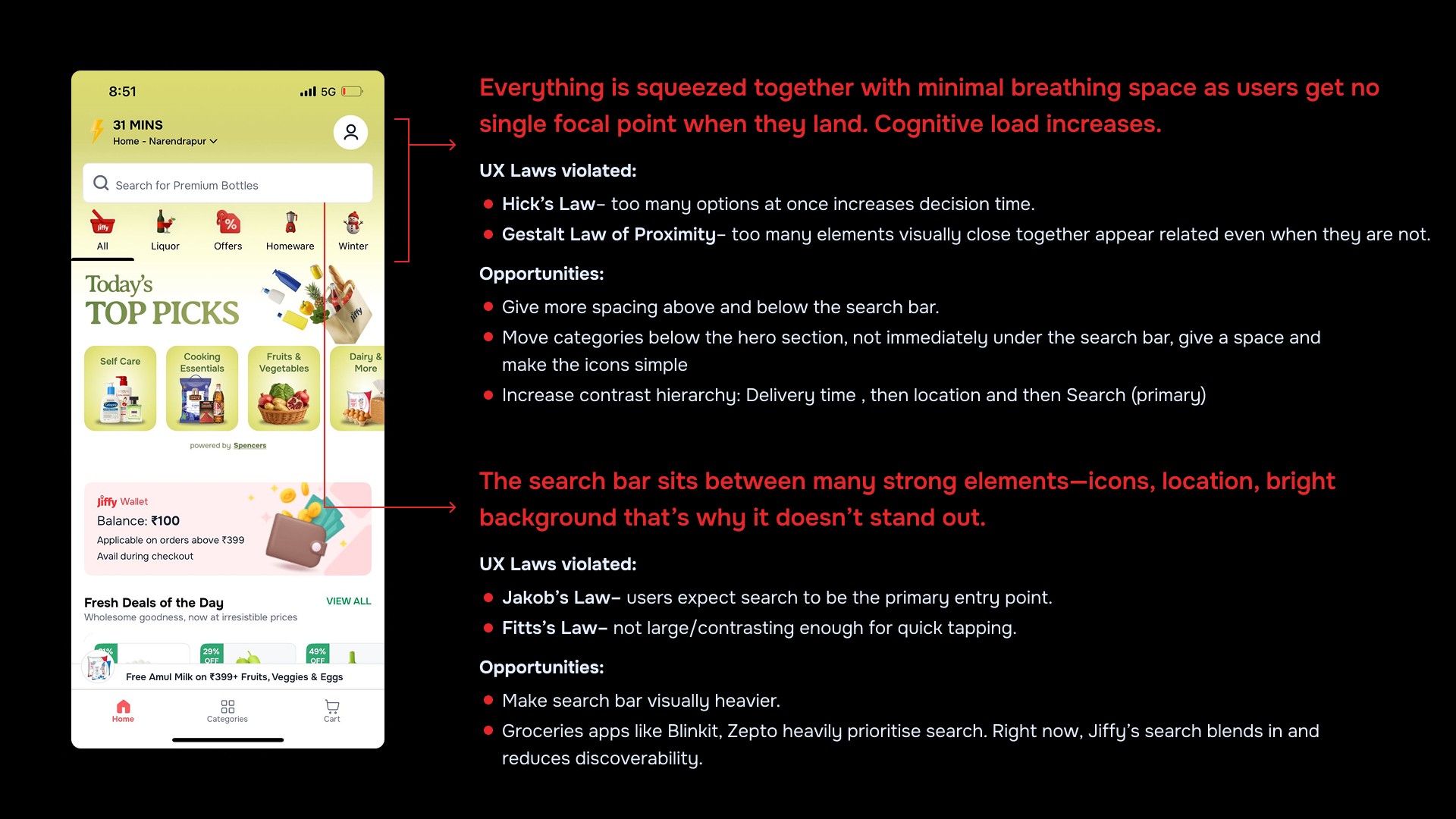
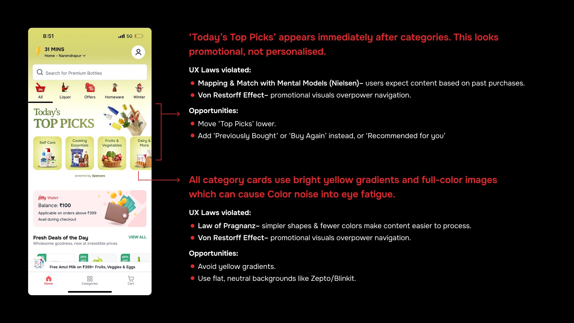
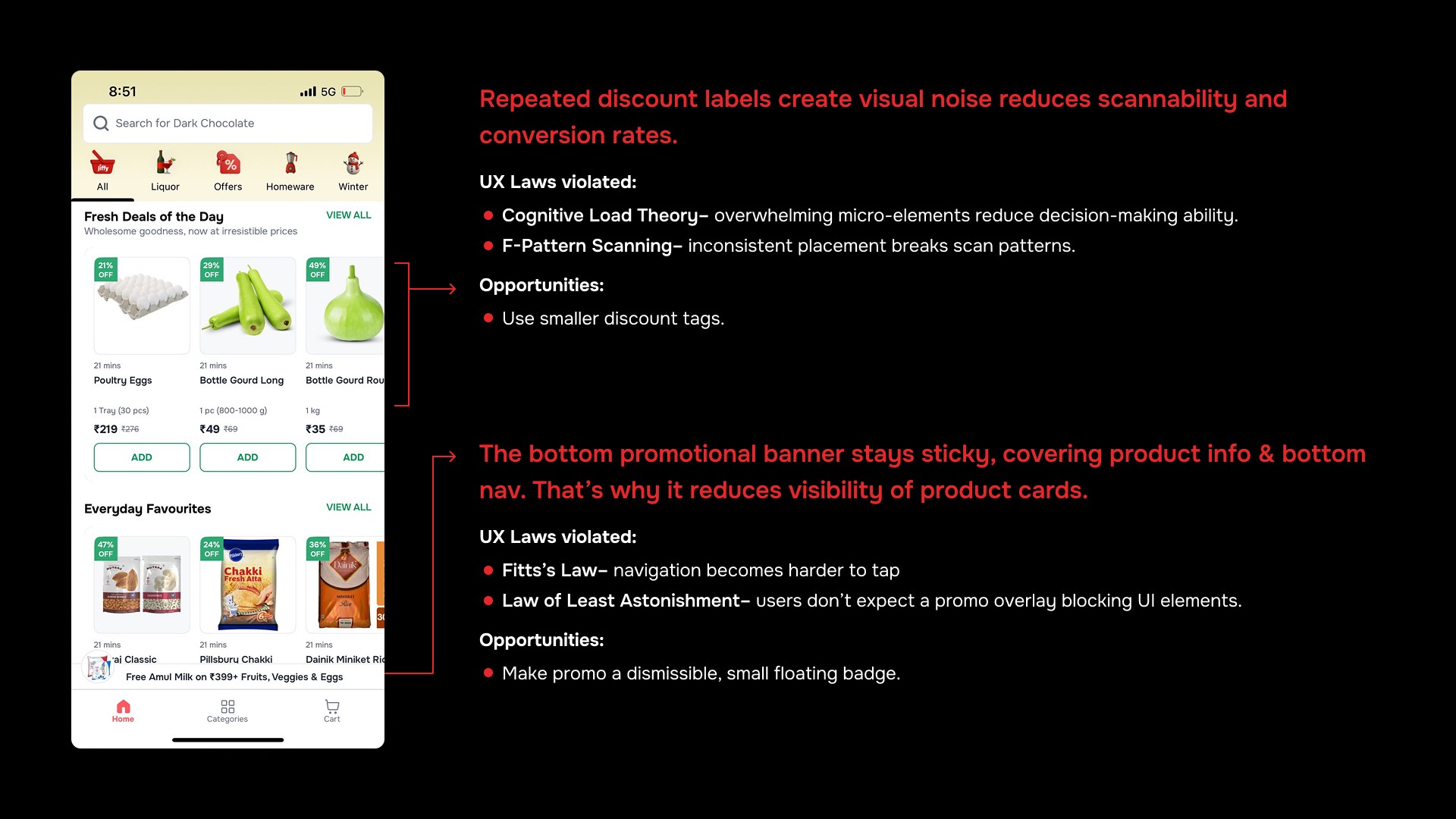
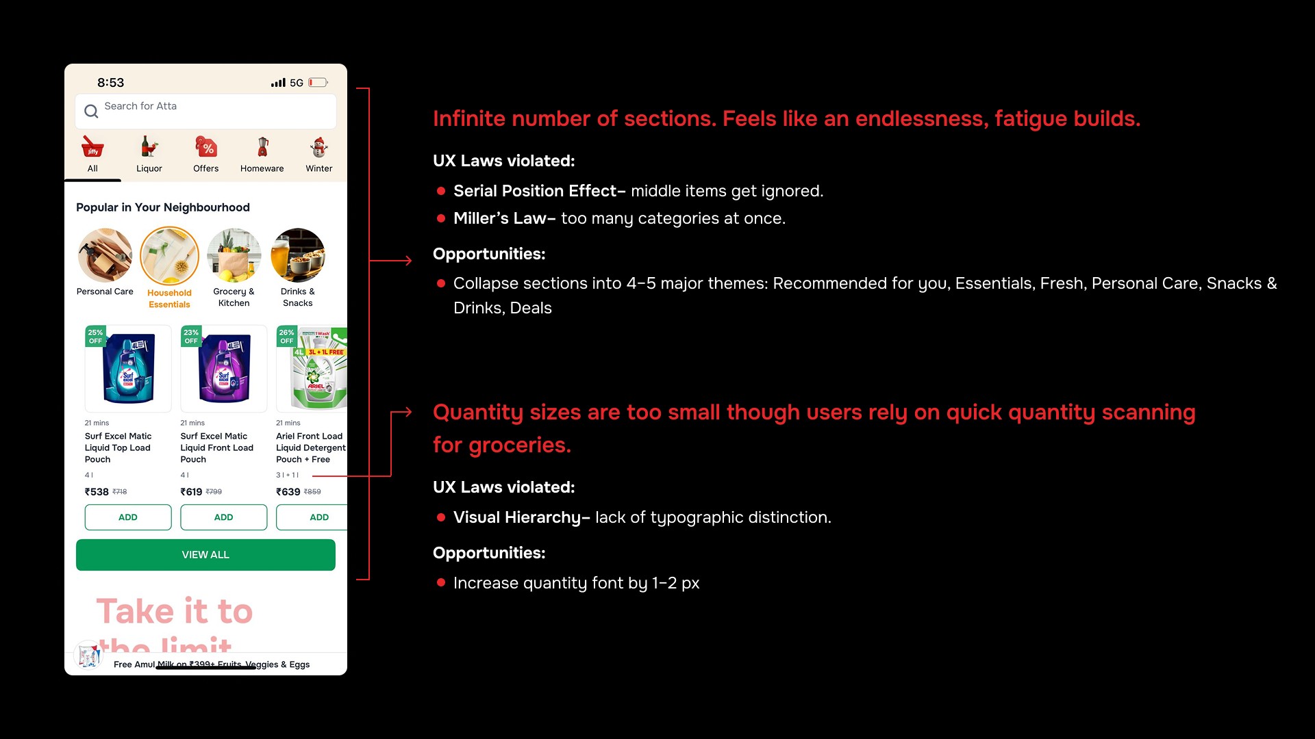
Cognitive overload and ineffective user journeys result from the current homepage's clutter, unclear hierarchy, and lack of personalization.
Design Process
For the time constraint, I followed 2D- DIscover, Design phases to create a intuitive, mobile first and user friendly homepage of Jiffy.

Discover
In the Discover phase, I conducted a detailed UX/UI audit of Jiffy’s current homepage, identifying issues in clarity, navigation, hierarchy, and overall usability. Alongside this, I performed a target audience study to understand user behaviours, needs, and expectations across Jiffy’s key markets.
These insights revealed core pain points and guided the direction for an improved, user-centric design.
New Feature Ideas
Jiffy ‘Smart Basket’ (Auto-Fill Weekly Essentials)
A feature that automatically builds a basket of items the user buys regularly— milk, bread, eggs, rice, detergent, etc.
Why it can be powerful:
Reduces shopping time
Helps people who repeat similar grocery lists weekly.
How it works:
Predicts weekly/monthly patterns.
Suggests "Your weekly basket" ready to checkout.
Repeat Item Reminders (Milk, Atta, Rice, etc.)
A reminder based on previous purchase intervals: ‘Your milk might be running low. Reorder?’ ‘Time to restock cooking oil?’
Why it can be powerful:
Reduces shopping time
Creates recurring buying behaviour.
How it works:
Predicts weekly/monthly patterns.
Personalized nudges
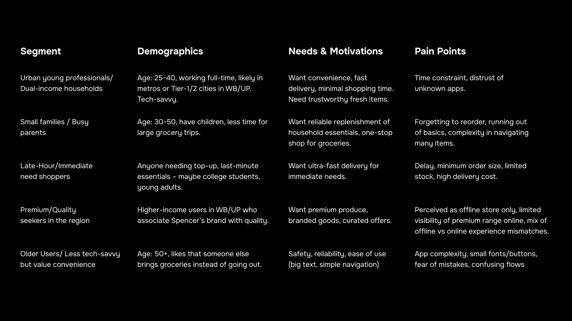
Target Audience
Jiffy serves as a quick-commerce grocery delivery service, promising 20-30 minute delivery by leveraging Spencer’s existing stores in West Bengal & Uttar Pradesh. The quick delivery grocery market in India is surging, with younger, urban users increasingly using on-demand apps.
Therefore, the target audience sits at the intersection of grocery consumers and on-demand delivery seekers.
Solution
I conceptualized a unique visual narrative using bull and bear as the characters to narrate the idea to users. I chose bull and bear specifically as they are perfectly suitable characters for stock market.
Created custom hand illustrations first and then converted and iterated them digitally in illustrator. Made bull and bear in playful, context-rich scenarios (swinging, surfing, partying)—each symbolizing different aspects of momentum.
Developed taglines like “Everyone Loves a Good Swing” and “Ready to Ride the Momentum Wave?” to simplify the idea while keeping it action-driven.
Designed 3 campaign creatives tailored for carousel ads and static promos, each introducing a feature (sector-based scores, scan tools, portfolio momentum).


Impact
Here, the outcomes and achievements of the project are highlighted.
Increased Feature Awareness:
Over 45% rise in in-app engagement for the new Momentum Score tab within 10 days of campaign launch.
Boosted Social Metrics:
Instagram: +38% higher engagement than average feature posts
Facebook: Reach doubled compared to last campaign
Conclusion
This project showcased the power of visual storytelling in fintech—where complexity often overwhelms. By translating a technical feature into a relatable, creative campaign, I helped bridge the gap between product value and user curiosity, driving both brand warmth and feature adoption.